
Ev’s Epoxy
Ecommerce Web App Project
My Role
UI/UX & Visual Design
Duration
3 Months
Tools Use
Figma, InVision, & Illustrator

Overview
Ev’s Epoxy is an online shopping tool for those specifically looking for modern, creative and thought-provoking epoxy and resin creations. Whether a customer is looking for a unique set of resin coasters or an exotic epoxy river table for a conference room, Ev’s Epoxy has it all.
To create a clean and easy-to-navigate tool for people who want to shop for key items, particularly those that are hard to find in traditional stores, without going into a physical location.
Objective
Today, many users are so busy with work and life obligations that they don’t have time to physically go into a store and purchase an item. It’s much easier to get online and make a purchase from the convenience of their home, car, or wherever they may be.
Problem
User Stories
“As a customer, I want there to be a variety of payment options, so that I can choose the payment option best for me.”
“As a new customer, I want to access the inventory without having to register so that I can make sure this store has what I’m looking for before having to create an account.”
“As a customer, I want to be able to place multiple items in a shopping cart so that I can purchase more than one item at any time.”
“As a customer, I want to see what other customers have said about products and how they have rated them, incase it influences my purchase decisions.”
User Flow
Considering the user stories that were gathered as well as the brief and 5 W’s, I created a user flow allowing my users to accomplish their main goal of purchasing a specific table.

Low & Mid Fidelity Wireframes


After my user flow was mapped out, I began a series of Crazy 8 paper sketches so I could get a number of ideas out quickly. After several iterations of sketches, the following low-fidelity paper screens were drafted. A mobile first design approach was used in this case as the design brief defined users as making purchases from the convenience of their home, car, work, etc.
Once I polished my low-fidelity wireframes, I then digitalized my screens for the user flow in Figma.
User Testing
At this point, I created a prototype in Figma of my mid-fidelity screens in order to gain some good user feedback on my designs. I wanted to make sure I didn’t get too far into the design process without testing the screens first for any pain points.
A description of the e-commerce site and scenario was given to five prospective clients. They were asked to navigate to a River Table called “Icy Escape”. Once found, they would need to add it to their cart, which already contained a set of coasters, and then complete the purchase. I ended up gaining valuable feedback and insight of pain points and suggestions and implemented them into my designs.
The majority of the users felt that the app design was “beautiful” and “done very nicely”. They also felt that the “checkout process was simple” and “it was easy to navigate to where I needed to go in order to make the purchase”. However there were a few critical suggestions that I implemented into my hi-fidelity wireframes and final screens.

Visual Identity
After determining the personality and values, I created the Branding Guidelines for the UI consisting of the typography, logo variations, color palette, image style, and the writing style of the brand.
Using Illustrator, I created a logo that was a representation of what Ev’s Epoxy is all about – epoxy creations. The circular design represents the design of an epoxy pour. The color palette was chosen based on the elegant, feminine theme of the UI.

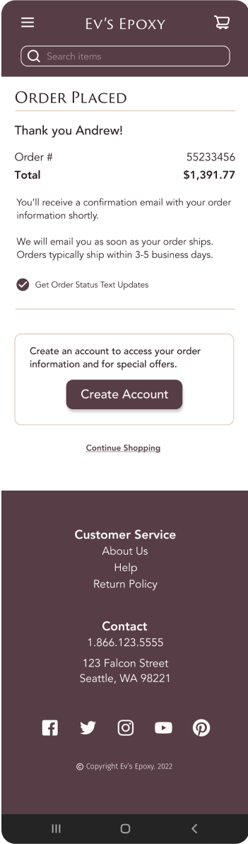
Final UI Screens
Once the suggested changes from the user feedback were implemented into the high-fidelity wireframes, it was time to create the final UI design. During the process I focused on keeping my layers organized and my UI pixel perfect to ensure handoff went seamlessly.


Mockups


Reflection
The Challenges
Looking back, my greatest challenge was my lack of the e-commerce interface knowledge from a UI designer’s standpoint. Though I have done a good deal of online shopping, I realized I typically move through the UI without even realizing many of the patterns that go into each screen. I had to go back and refine the ‘Checkout’ process multiple times in order to rid my screens of any pain points.
My favorite part of this project was creating the branding and styling for the interface. The goal was to have a rich, elegant look but something that felt friendly and welcoming to the user at the same time.
What Went Well
Moving Forward
My future plans would be to broaden my user testing audience, making sure it’s intuitive for all users, and conduct more preference and prototype testing throughout the design stages. User feedback plays such an important role in creating a good user experience.