
EAT
Responsive Web App Project
My Role
UI & Visual Design
Duration
3 Months
Tools Use
Adobe XD, InVision, & Illustrator
Overview
EAT is an easy-to-use recipe application for the beginning chef to the advanced culinarian. This web-responsive application provides users the ability to search for recipes with simplified instructions, add items to a shopping list, and create weekly meal plans.
To create a clean and easy-to-navigate tool for people who want to search for a recipe without all of the confusing, un-needed videos and author thoughts in recipe apps on the market today.
Objective
Today, many users are so busy with work and life obligations that they don’t have time to physically go into a store and purchase an item. It’s much easier to get online and make a purchase from the convenience of their home, car, or wherever they may be.
Problem
My Role
For this app, I primarily focused on building out the branding, UI and visual design of the product.
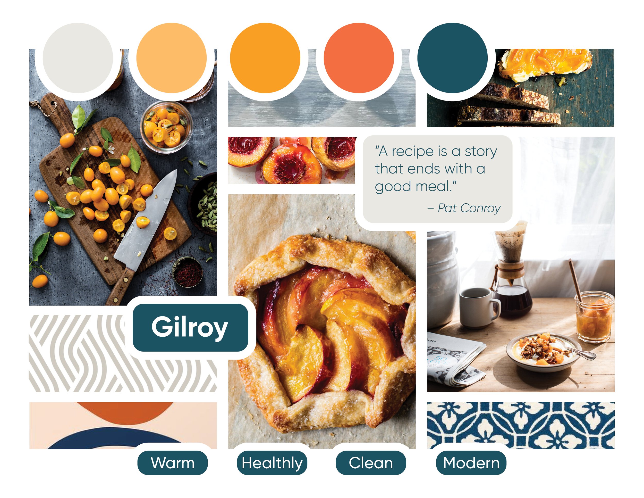
Moodboard
For the visual aspects of the UI, I wanted to create a clean, modern and fresh feeling for the user that would also work with the simplicity aspect of the layout design. After gathering inspiration ideas, I created two moodboard options for this app, ultimately landing on the one below after I felt like it conveyed the ultimate theme of the UI and spoke to a wider range of users.
Guided by the moodboard, I created a color palette that evoked those feelings as well as a clean and simple typeface. Red and orange shades are known to evoke hunger, so combining those with a modern blue seemed to create the clean and fresh concept I was trying to convey.
Style Guide
Guided by the the chosen moodboard, I created a color palette that evoked those clean, modern, and fresh feelings as well as a clean and simple typeface.
The style guide I created includes that color palette, typography information, iconography, interaction details, controls and buttons, imagery, logo and branding info, as well as copy guidelines for the UI.

Preference Testing
I wanted to get some quick user feedback on a few of my screens so I used UsabilityHub to create a series of A/B Preference Tests. With my Styling Guide complete, I created a couple hi-fidelity wireframes of the screens I wanted feedback on.
The splash screen was one of those as I wanted to get an idea of what users felt was more efficient and easy to understand what the task was. I conducted a preference test of my original (version A) and a variant of that (version B).

Version A
Preferred by 17% of Users

Version B
Preferred by 83% of Users
Version B was without a doubt the preferred screen by far. Users said it was “Easier to read”, “Cleaner, as the other one looks more cluttered”, “The logo stands out more”. This gave me the valuable feedback I needed to know which direction to move forward with for the design of this particular screen.
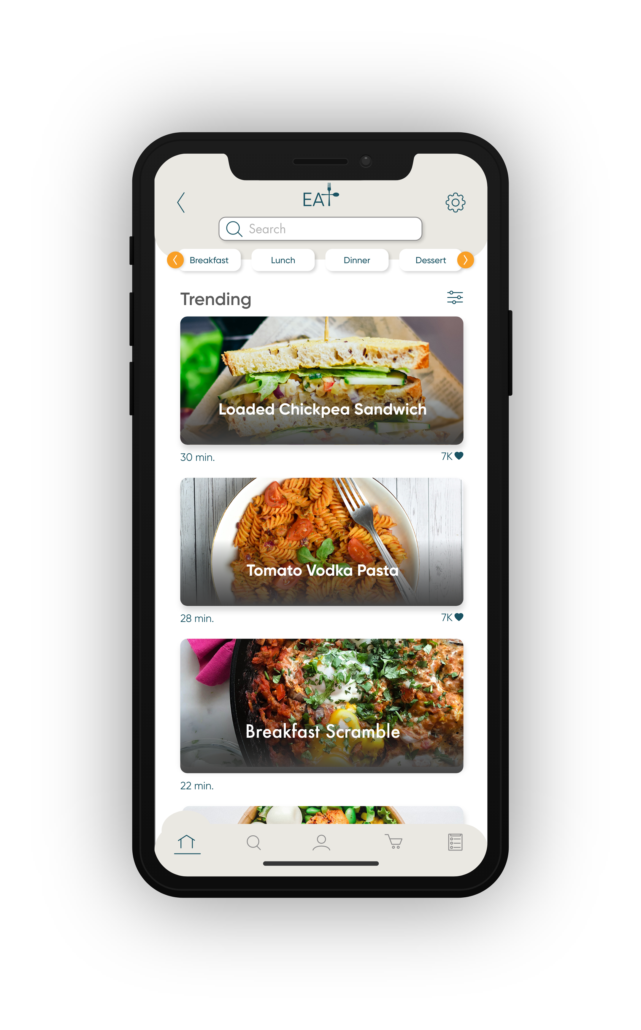
Final Screens & Mockups
Using the mobile-first approach, I created a series of screens for the recipe app and then developed the responsive screens at an additional 3 breakpoints for each screen. I applied the feedback I received from the user testing to ensure my designs would give the best user experience possible.


Reflection
What Went Well
During the initial stages of research and design for this UI, generating multiple design solutions quickly, using the Crazy 8’s Method, was very helpful in getting outside of my own design preferences. The rapid prototyping allowed me to find a useful solution for users rather than what I felt would work best and didn’t take large amount of time to do.
The Challenges
When it became time to design a user flow, I realized I had an extremely large list of features that I wanted to incorporate into this responsive app. When I began the wireframes, it became more complex than I thought and didn’t represent my original MVP or solution I wanted to create with this app, which was to design something simple, effective and quick to use. Because of that, I revised my screen ideas to incorporate those features that seemed to be the most needed and important and left the desired features for something that could be added at a later time.
Moving Forward
Moving forward, I want to spend a bit more time developing on the clarity of my low-fidelity wireframes. I believe by doing this, I’ll be able to more efficiently build out my mid-fi wireframes with less confusion because of the detail added to the low-fi versions. I also would like to add more testing throughout the design phase to continue to making sure I’m building this for the user and not any personal preferences.